Adding custom chart to BI Dashboard
Creating custom charts in Dashboard is a seamless process powered by Cube.js, a robust analytics framework. Follow the steps below to add personalized visualizations that accurately represent your data insights.
Step-by-Step Guide
1. Access the Cube Playground
To begin building a custom chart:
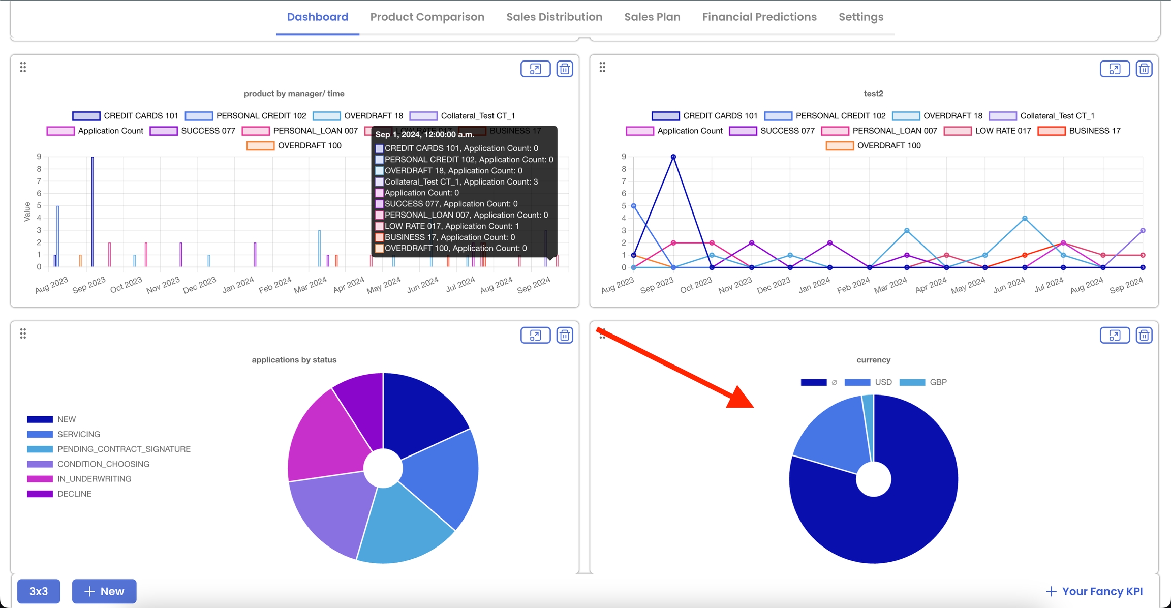
Click on the + Your Fancy KPI button located prominently on the dashboard interface.
This action will open the Cube Playground page, your dedicated environment for crafting custom charts.

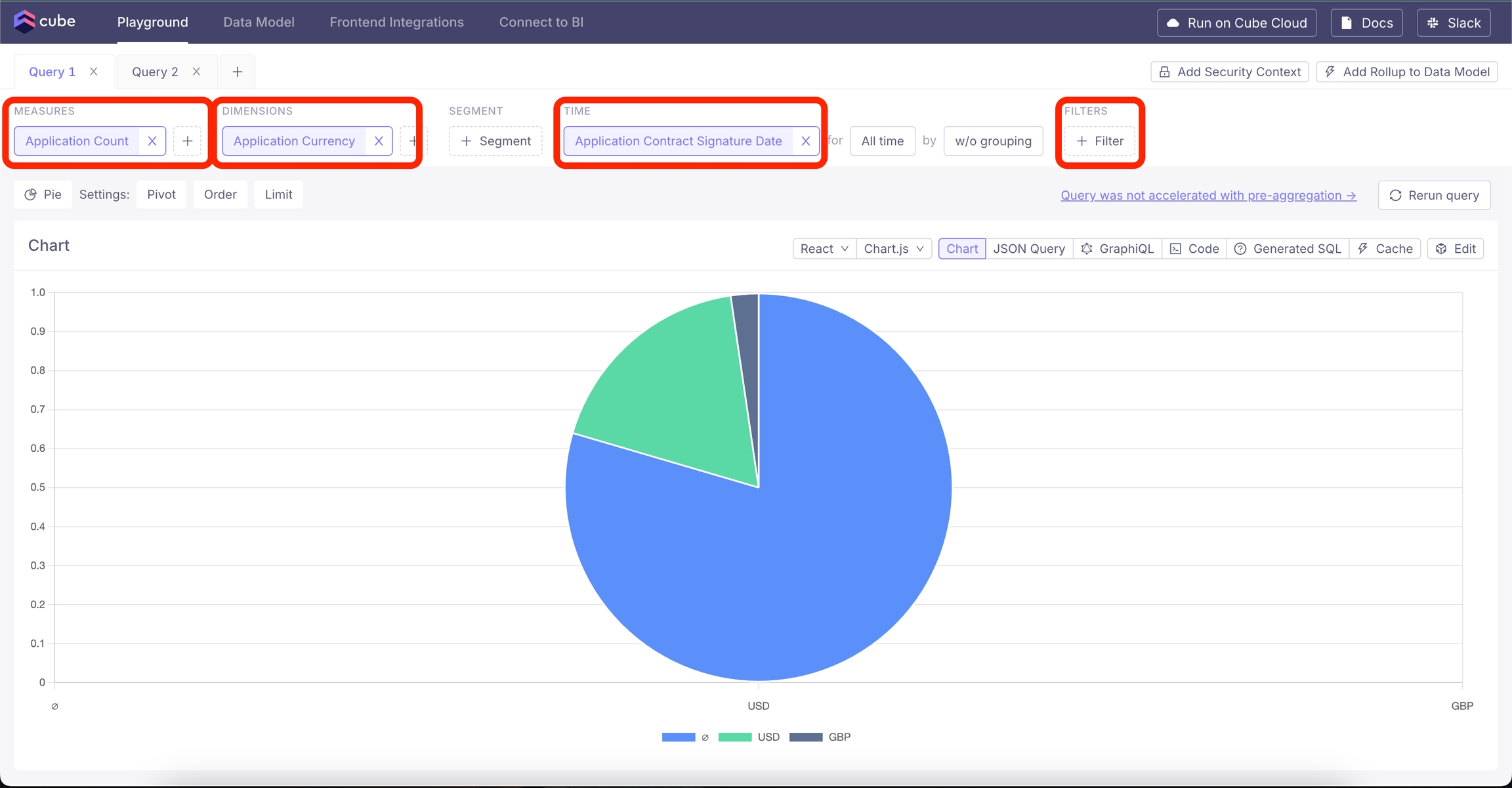
2. Configure Your Chart in Cube Playground
Within the Cube Playground, you'll define the data and appearance of your chart:
Select Measures and Dimensions:
Measures: Choose the quantitative metrics you want to analyze (e.g., count, total amount).
Dimensions: Select the categorical data to segment your measures (e.g., application type, product name).
Apply Filters (Optional):
If you need to narrow down your data, apply filters based on specific criteria (e.g., date ranges, customer segments).
Choose Time Dimensions:
Define the time-based aspects of your data, such as daily, monthly, or yearly aggregations, to analyze trends over periods.
Select Chart Type:
From the available options, choose the type of chart that best represents your data:
Line Chart
Bar Chart
Area Chart
Pie Chart
Generate the Chart:
Once you've configured the measures, dimensions, filters, and chart type, the Cube Playground will render a preview of your chart.
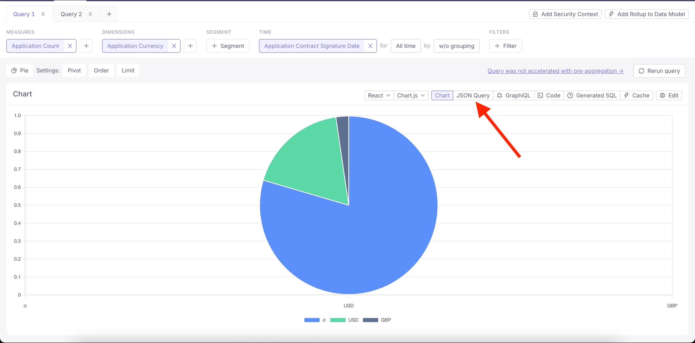
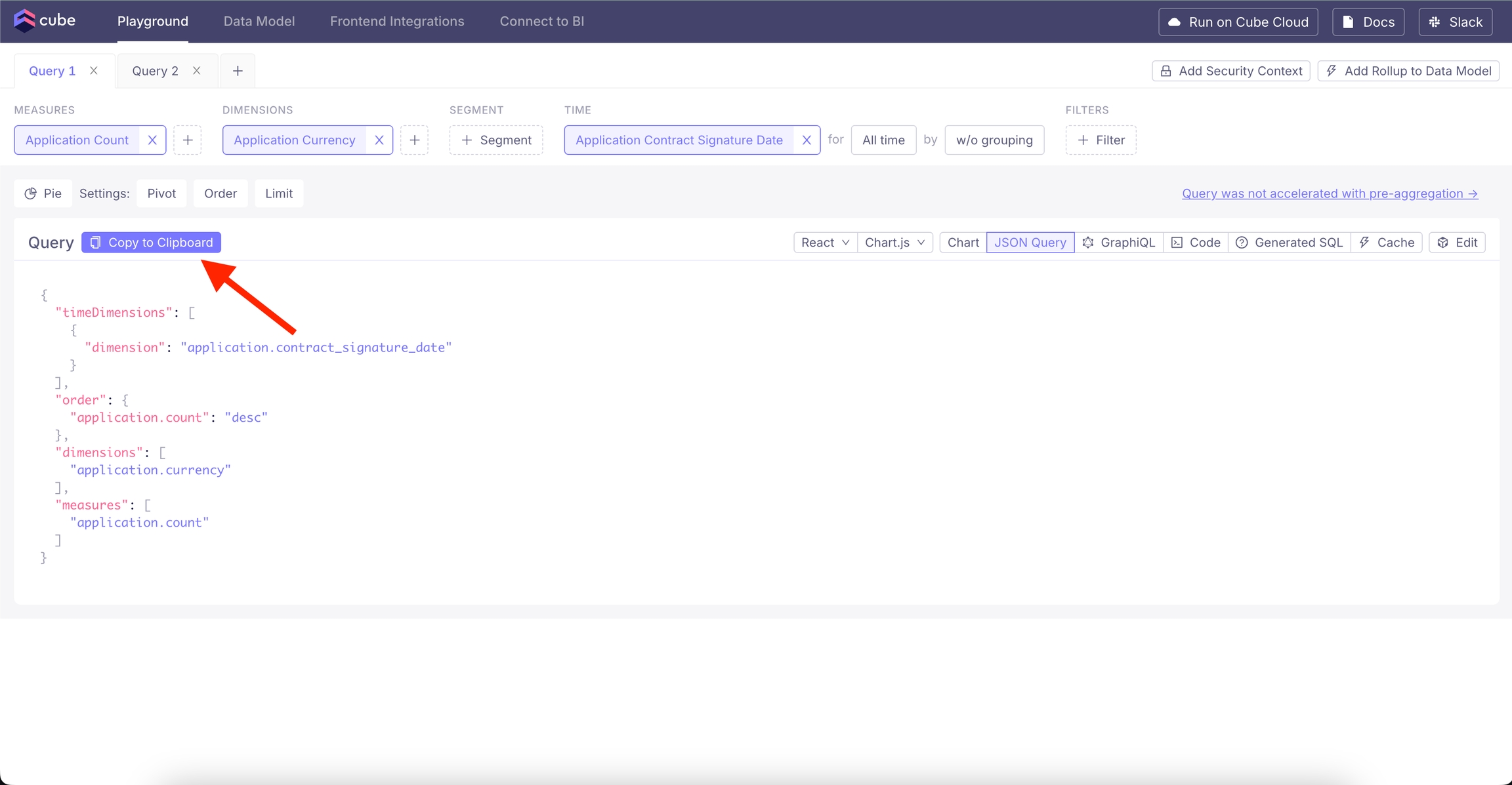
3. Export the JSON Query
After customizing your chart:
* Click on the JSON query tab located within the Cube Playground interface. This tab displays the underlying JSON configuration of your chart.
* Click the Copy to Clipboard button to copy the JSON query that defines your chart's data and configuration.
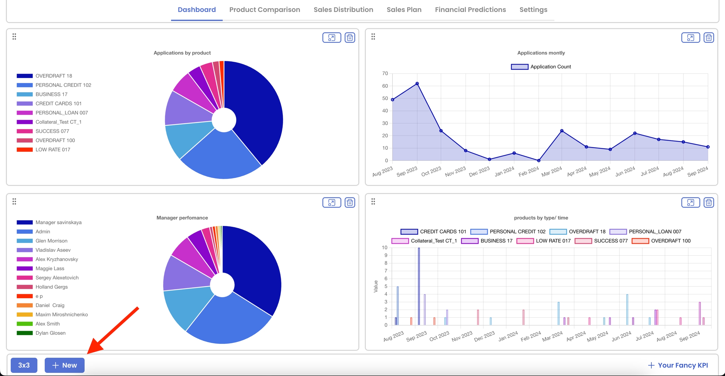
4. Add the Chart to Your Dashboard
With the JSON query copied, proceed to integrate the chart into your dashboard:
Return to the Dashboard Page:
Navigate back to your main dashboard.
Open New Chart dialog:
Click on the + NEW button to open the chart addition interface.
Configure the New Chart:
Chart Name: Enter a descriptive name for your chart to easily identify it within the dashboard.
Chart Type: Select the same chart type you chose in the Cube Playground (e.g., line, bar, area, pie) to ensure consistency.
JSON Configuration:
Paste the JSON code you copied earlier into the json text area. This embeds the data and configuration settings you defined in Cube Playground.
Finalize and Add the Chart:
After filling in all the necessary details, click the Add button.
Your new chart will now appear on the dashboard, fully configured and ready for use.
Tips for Effective Chart Creation
Consistent Chart Types: Use the same chart type in both Cube Playground and the Dashboard to maintain visual consistency and avoid configuration mismatches.
Descriptive Naming: Give your charts clear and descriptive names to make navigation and data interpretation easier for all users.
Leverage Filters: Utilize filters to create dynamic and interactive charts that can adapt to different data views and analysis needs.
Test Your Charts: After adding a chart, review it to ensure that the data is accurately represented and that the visualization meets your analytical requirements.
Last updated
Was this helpful?